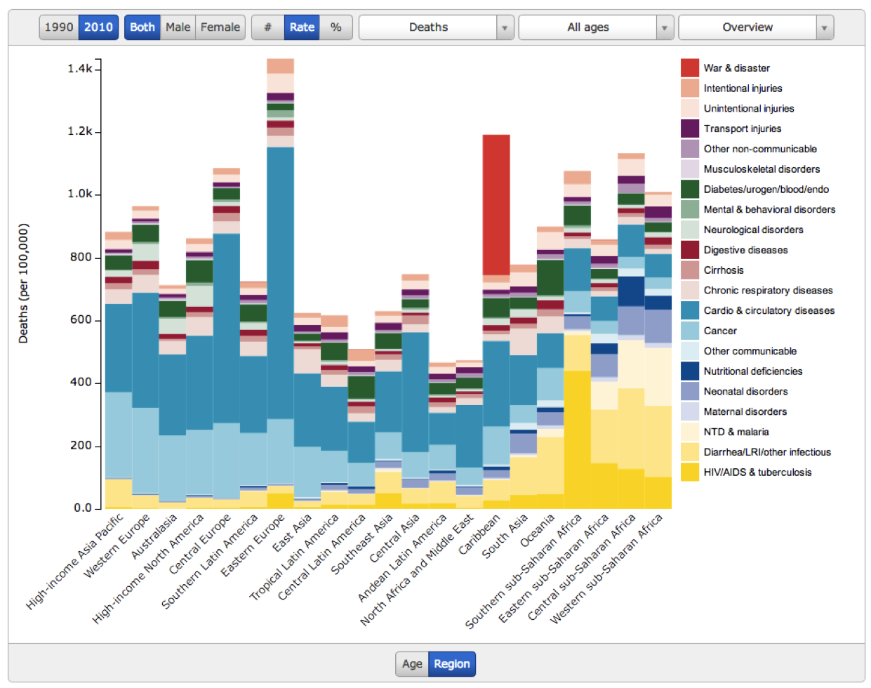
This is 2010 data, so most striking is the Haiti earthquake. As far as I can tell, however, the effect of Vodka on eastern European cardio is worse. No doubt intentional and unintentional injuries are related as well.
AIDS in southern Africa should give us all pause. War deaths seem lower than expected for the continent, but I guess 2010 (and the years since) have been more peaceful than the previous two decades. That too is a mostly unsung accomplishment.
Bottoms up to the Russians in the audience.
From the Guardian data blog. h/t Pia Raffler


45 Responses
¿De qué muere la gente? Interesante gráfico sobre las causas de muerte más comunes en 2010 http://t.co/Wo9nVTg0
Why does # of deaths by #cancer appear to rise with development? RT @Suanzes: “Deaths around the world” http://t.co/YGsdwgVD Datos de 2010
RT @Suanzes: Gráfico chulo del dÃa: “Deaths around the world” http://t.co/ceqATTtx Datos de 2010
RT @Suanzes: Gráfico chulo del dÃa: “Deaths around the world” http://t.co/ceqATTtx Datos de 2010
RT @Suanzes: Gráfico chulo del dÃa: “Deaths around the world” http://t.co/ceqATTtx Datos de 2010
RT @Suanzes: Gráfico chulo del dÃa: “Deaths around the world” http://t.co/ceqATTtx Datos de 2010
RT @Suanzes: Gráfico chulo del dÃa: “Deaths around the world” http://t.co/ceqATTtx Datos de 2010
Gráfico chulo del dÃa: “Deaths around the world” http://t.co/ceqATTtx Datos de 2010
RT @SH_lelabo: #Data Taux et causes des décès dans le monde http://t.co/T5zaDAiv ♻ @AstonLockheed @Ecointerview
Alison Cummins: You’re right of course: I ineptly misread the y-axis as # of deaths, not the death rate. A good lesson that I shouldn’t post on the fly. Thanks.
Death causes around the world via @bill_easterly.EasternEurope highest on heart decease:stress&eating habits in my view http://t.co/jGkCwAav
#Data Taux et causes des décès dans le monde http://t.co/T5zaDAiv ♻ @AstonLockheed @Ecointerview
via @m_clem, here’s a chart on the variable factors contributing to deaths around the world: http://t.co/lUbOrFsC on @cblatts’s blog
RT @bill_easterly: Causes of mortality by world region–um, great visualization? http://t.co/1CLJRWEC
“@bill_easterly: Causes of mortality by world region–um, great visualization? http://t.co/F8tZNWrj” te va a gustar @valenep
“@bill_easterly: Causes of mortality by world region–um, great visualization? http://t.co/F8tZNWrj” great visualization indeed!
RT @AstonLockheed: Les morts autour du monde http://t.co/x0vtn16V
Les morts autour du monde http://t.co/x0vtn16V
RT @bill_easterly: Causes of mortality by world region–um, great visualization? http://t.co/1CLJRWEC
RT @bill_easterly: Causes of mortality by world region–um, great visualization? http://t.co/1CLJRWEC
RT @bill_easterly: Causes of mortality by world region–um, great visualization? http://t.co/1CLJRWEC
RT @bill_easterly: Causes of mortality by world region–um, great visualization? http://t.co/1CLJRWEC
RT @bill_easterly: Causes of mortality by world region–um, great visualization? http://t.co/1CLJRWEC
RT @bill_easterly: Causes of mortality by world region–um, great visualization? http://t.co/1CLJRWEC
Depressing chart of the day: Causes of death by region, around the world http://t.co/c33ui3oK
RT @bill_easterly: Causes of mortality by world region–um, great visualization? http://t.co/1CLJRWEC
Sobering. RT @bill_easterly: Causes of mortality by world region–um, great visualization? http://t.co/1DIvfPFG
RT @bill_easterly: Causes of mortality by world region–um, great visualization? http://t.co/1CLJRWEC
RT @bill_easterly: Causes of mortality by world region–um, great visualization? http://t.co/1CLJRWEC
Whoaa! Def click thru for interactive chart. MT @bill_easterly Causes of mortality by world region http://t.co/cEdqxdwx
RT @bill_easterly: Causes of mortality by world region–um, great visualization? http://t.co/1CLJRWEC
The thing that makes the low data quality the most clear, I think, is the chart’s claim that Eastern Europe has a death rate that is 40% higher than Africa. That seemed obviously false. Overdrinking is surely bad, but can it really compete with the the triple whammy of the AIDS pandemic, malaria, and an incredibly strained and under-resourced hospital system?
Indeed a quick check against the two sources listed on Wikipedia seemingly confirms my suspicion that the data is pretty bogus. http://en.wikipedia.org/wiki/List_of_sovereign_states_and_dependent_territories_by_death_rate
RT @cblatts: Chart (but not pick-me-up) of the day: Deaths around the world http://t.co/3Y4HMxda
Michael,
The death rate for war and disaster for Haiti according to this graph is about 450/100,000. Over a population of 10,000,000, that means a total death toll of 45,000. Around 1/3 of the best estimate you cite.
The Haiti estimate doesn’t help the credibility of these numbers. The earthquake was cataclysmic and one of the deadliest on earth in the last millennium, but no credible estimate suggests that more than 400,000 people died, as this graph asserts. The soundest peer-reviewed, survey-based estimate is this one: around 150,000 or somewhat more. Even the government’s estimate is only 316,000. Not sure where they got this estimate of more than 400,000.
If I understand the chart correctly, the death rate for Andean Latin America is on the order of one-half to two-thirds the death rate of High-income North America.
Is this a comment on the low quality of the data or the high quality of Andean Latin Americans?
RT @cblatts: Chart (but not pick-me-up) of the day: Deaths around the world http://t.co/3Y4HMxda
RT @cblatts: Chart (but not pick-me-up) of the day: Deaths around the world http://t.co/3Y4HMxda
RT @cblatts: Chart (but not pick-me-up) of the day: Deaths around the world http://t.co/3Y4HMxda
RT @cblatts: Chart (but not pick-me-up) of the day: Deaths around the world http://t.co/3Y4HMxda
RT @cblatts: Chart (but not pick-me-up) of the day: Deaths around the world http://t.co/3Y4HMxda
I work in sanitation. its particularly tragic to see the number of deaths in sub-saharan africa due to diarrhoeal diseases.
good sanitation actually has a greater impact than access to clean water
@cblatts Eastern European figures the shocker-region is heading nowhere fast.