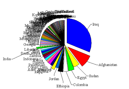
Graph of the day: Where the foreign aid goes
Subscribe to Blog
Recent Posts
When is War Justified?
October 24, 2022
Conversation with Teny Gross on Gang Violence
October 20, 2022
The 5 reasons wars happen
October 14, 2022
Advanced Master’s & PhDs
September 10, 2022


20 Responses
Terrific work! This is the type of information that should be shared around the web. Shame on the search engines for not positioning this post higher!
I can’t say that it makes much sense to lump Egypt in with Iraq and Afghanistan, since the latter two are countries where the US is pressing explicitly direct military objectives, whereas I think we’d be hard pressed to find a country where the US is not pressing political objectives of one sort or another.
Also, there should be a distinction made between military aid in general and military aid going to American “boots on the ground,” as it were. I don’t have the numbers at my fingertips here, but if I recall correctly, the US generally doles out around $5.5 billion in military assistance a year (around 20% of total annual aid), of which the vast majority goes to Israel ($2.2 billion) and Egypt ($1.3 billion). Other assistance to Israel that generally flies under the radar includes loan guarantees and the subsequent forgiving of those loans, which means that a good part of the money doesn’t actually get recorded as aid at all.
Either the heading/topic of the graph need to be changed or the aid given to Israel needs to be included… Otherwise its highly misleading
Chris, thanks for linking to the chart. We should have specified that this was ODA only, though some of your readers have picked up on this. I had to make some clarifications for Economix readers so I thought I’d do so here as well.
As some of you already know, the OECD-DAC database is the most complete collection of data we have at the moment on foreign aid that can be compared across donor countries, and OECD data includes only what is called Official Development Assistance (ODA).
For funds to be counted as ODA they have to 1) go to a country on an approved list of ODA-eligible recipients, and 2) have “the promotion of the economic development and welfare of developing countries” as their main objective.
So this chart does not include military aid, and it would not include aid to Israel even if that aid were economic in nature, since Israel is not on the DAC-approved list of developing countries. (www.oecd.org/dac/stats/daclist)
One purpose of the (admittedly ugly) chart was to show that even excluding actual military aid, a large chunk of the funds which should by definition have the “promotion of economic development and welfare of developing countries” as their primary objective is actually going to countries (Iraq, Afghanistan, Egypt) where the US has pressing political and military objectives, as opposed to countries where the economic needs and the potential to improve welfare are the greatest.
If the US spent its Official Development Assistance to promote economic development in countries with the greatest need, many of those nations whose names are essentially blacked out in our chart would be receiving a larger piece of the pie.
@Sriram, we pulled out India because we wanted to talk about it separately as one example of a development priority (because it is home to a very large number of the world’s poor) that doesn’t actually receive much development aid from the US.
The NYT did a much more readable version of this (they used a world map), though it may take awhile to dig up since their search functionality is so poor.
Most of these country’s hate us.. I don’t get it? Why are we giving money to sh*t holes like India and Libia? We can’t even take care of our own people.
Obviously this graph defines foreign aid to exclude military assistance. According to a Congressional Research Service report from Dec 2009 ( http://www.fas.org/sgp/crs/mideast/RL33222.pdf ), Israel was the largest recipient of US foreign aid until it was surpassed by Iraq in 2004 – it consistently receives in excess of US$3 billion annually, although in the last few years it has only been about US$2.5 billion. Until recently the aid has been about 2/3 military, although since 2008 it has been essentially 100% military grants. This means that in 2008 each US citizen contributed $8 to buy $430 worth of of weapons for each Jewish Israeli (I excluded non-jewish Israelis from the calculation since it is doubtful that any of this aid goes to Israelis of Palestinian descent).
Where’s Israel?
And here I thought most foreign aid ended up in Swiss bank accounts.
Cool graph. This may be a naive question, but does the money we give to Israel not count as aid?
It seems to depend who you ask. Israel would rank second to Iraq, with $2.4 billion last year, I believe. Clearly it’s not development aid, which might be why OECD don’t include it in their figures, but if included it would only make the overall picture look even worse.
Hey, yes you’re right, I got that afterwards. I just wanted to know where Rwanda ranked.
Pottery Barn Foreign Aid Policy: If you break it, you buy it.
WLT see this per capita
Being an Indian I m curious to know why my country name alone has been marked out separately from the crowd
Good question!
The crowded, illegible labels are what I love most about this graph. They communicate more information as they stand.
I agree.. its a work of art, that black solid streak speaks volumes. Could probably be hung in a museum or something..
Would be good to be able to read the place names – Arial size 7 might have been a good idea!
Nice idea, but possibly the ugliest pie chart I have ever seen.