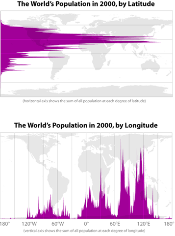
Graph of the day
Subscribe to Blog
Recent Posts
When is War Justified?
October 24, 2022
Conversation with Teny Gross on Gang Violence
October 20, 2022
The 5 reasons wars happen
October 14, 2022
Advanced Master’s & PhDs
September 10, 2022


22 Responses
Latitude map should be put in Jared Diamond’s Guns, Germs, and Steel: The Fates of Human Societies.
would love to see these graphs on posters. I would buy one.
Please tell me that the latitudinal map is at least weighted for the _length_ of the circumference at each latitude… If not, it is still pretty cool, but painfully misleading.
You should at least link the original author, Bill Rankin: http://www.radicalcartography.net/histpop.html
Shame it’s a decade out of date, might actually be relevant otherwise.
another interesting graph would be a corresponding heatmap. Longtude and latitude on normal axes, with colour used to denote density, where black is 0, fading up through blue, green, to yellow, orange, red for ‘very high density’. Work at arcminute (or cooler, arcsecond) resolution.
Seeing the lights played out across the continents would be neat – but this sort of graph likely already exists.
Found an interactive map of what I wondered about – very fun to look around in.
http://sedac.ciesin.columbia.edu/gpw/index.jsp
Hey kids, let’s play nice on the blog.
Chris, you my friend are an ignorant anus head
Just because something isn’t in the exact format one wants does not make it useless. To be really powerful the graph could show those who are simply rude or constructive in their comments. One response type is simply rude while the other does a much better job of educating.
I don’t agree. Because you can see how much land mass there is per lat/long on the image, you have all the information you need.
Arthur, learn some humility, eh.
I’m not sure you can. That representation of the world seriously distorts at the poles.
Arthur is right — you need to scale by land mass per latitude and longitude for the graphs to have real power.
You have to look at the graph with Arthur’s comment in mind, but not stop as short as he did. Can you identify all of the major cities responsible for the major population spikes?
what software are you using for the graphs?
Actually, Arthur makes a good point about habitability.
The latitude across N. America, Europe and vast swathes of Russia is clearly the highest in terms of landmass, yet not population.
Interesting.
Arthur, Why don’t you do us all a favor and go and live in the sea?
It’s just freaking too cold to live here.
This treats Long’s and Lat’s as if they are all equivalent – but the ratio of land to water varies enormously and, as far as I am aware, very few people live on the sea……so basically bogus…..also no allowance made for habitability….
All in all it’s pretty…pretty useless
A few interesting variants would be:
1) population density by latitude
2) the animated version that shows the south bulging out in the future (although maybe not that dramatic)
Would have been nice to have had numbers on the population axes, but Paul K. didn’t have them either.
It’s a histogram, so would depend on the size of the bins.